Animationszauber
Geringer Aufwand, maximale Wirkung
© 03/2014 Martin W. Kirst / @nitram509

Agenda
- Wirkung
- Grundlagen Animation
- Prinzipien
- CSS Animationen
- Javascript Animationen
- Tweens / Tweening
Wirkung
Gibt Feedback
Lenkt Aufmerksamkeit
Erzeugt Emotion/Gefühl
Prinzip
Konsistenz > VielfaltWas?
Position
Rotation
Skalierung
Transformation
Wie?
Laufzeit (duration)
Verzögerung (delay)
Veränderungskurve (easing)
Easing
Hands on...
Easing


« Weitere ... http://easings.net »
CSS Animation - Einfach

#rocket {
  transition:
    bottom 4s ease-out,
    left 4s ease-out;
}
#rocket.start {
  bottom: 11px;
  left: -13px;
}
#rocket.end {
  bottom: 300px;
  left: 385px;
}
CSS Animation - Komplex
@keyframes up-and-down {
  0%   {bottom: 11px; }
  50%  {bottom: 145px;}
  100% {bottom: 11px; }
}
#rocket {
  transition: left 4s, ease-out;
}
#rocket.start {
  /* ... */
}
#rocket.end {
  animation: up-and-down 4s;
  left: 385px;
}
CSS Menüs

CSS Bilder

.box {
  transition:
    all 500ms
    cubic-bezier(0.190, 1.000, 0.220, 1.000);
  box-shadow: 0 1px 1px rgba(0,0,0,0.3);
  transform:  translateY(0) scale(0.95, 0.95);
}
.box.active {
  box-shadow: 0 11px 18px rgba(0,0,0,0.2);
  transform:  translateY(-20px) scale(1, 1);
}
CSS3 Advanced++
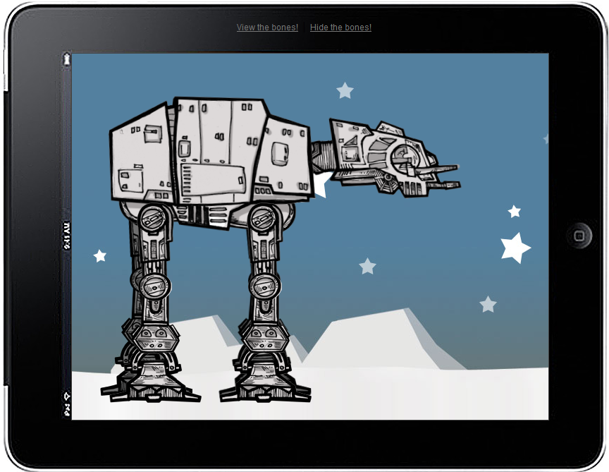

http://anthonycalzadilla.com/css3-ATAT/ ⋅ http://codepen.io/Sonick/pen/vijJl ⋅ http://tympanus.net/Tutorials/CreativeCSS3AnimationMenus/
Nachteile CSS-Animation
Nur DOM
Keine Interaktion
Keine Callbacks wenn fertig
Prozentuale Zeitangaben (keyframes)
JS - jQuery Basics
show / hide
fadeIn / fadeOut
slideUp / slideDown
animate (custom properties)
JS Fading & Sliding

JS - jQuery Beispiel
var logo = $('#bedcon-logo');
logo.animate({color: 255}, {
  duration: 4000,
  easing: 'swing',
  step: function (now, tween) {
    var color = 255 - (now | 0);
    this.style.backgroundColor =
          'rgb('+color+','+color+','+color+')'
  },
  complete: function() {
    // 2 Sekunden setTimeout()
    logo[0].style.backgroundColor = '#fff'
  }
});
Tweening
Schlüsselbildanimation
Bewegung zwischen Keyframes
Unabhängig von UI-Technologie
Tweening Beispiel
img = document.getElementById("bedcon-tween");
tween1 = new TWEEN.Tween( { x: 10 } )
   .to( { x: 190 }, 3000 )
   .onUpdate( function () {
     img.style.left = this.x + 'px';  });
tween1r = new TWEEN.Tween( { r : 0} )
   .to( { r: 360 }, 3000)
   .onUpdate(function () {
     img.style.transform="rotate("+this.r+"deg)";});
tween2 = new TWEEN.Tween( { y: 270 } )
   .to( { y: 10 } )
   .easing(TWEEN.Easing.Elastic.InOut)
   .onUpdate( function () {
     img.style.bottom = this.y + 'px';  });
tween1.chain(tween2);
tween1.start();  tween1r.start();
Fazit
JS + CSS >> JS xor CSS
Konsistenz >> Vielfalt
Einfach => Frameworks
Komplex => ...
Animation Fun

Danke ⋅ Thanks ⋅ Merci
Web apps deserve sexy transitions too!
Hakim's Experiments, Thoughts & Projects
http://codepen.io/Sonick/pen/vijJl
http://anthonycalzadilla.com/css3-ATAT/
http://tympanus.net/Tutorials/CreativeCSS3AnimationMenus/
sole/tween.js - Javascript Tweening Engine